


Client: Self
Work: Branding, Illustration


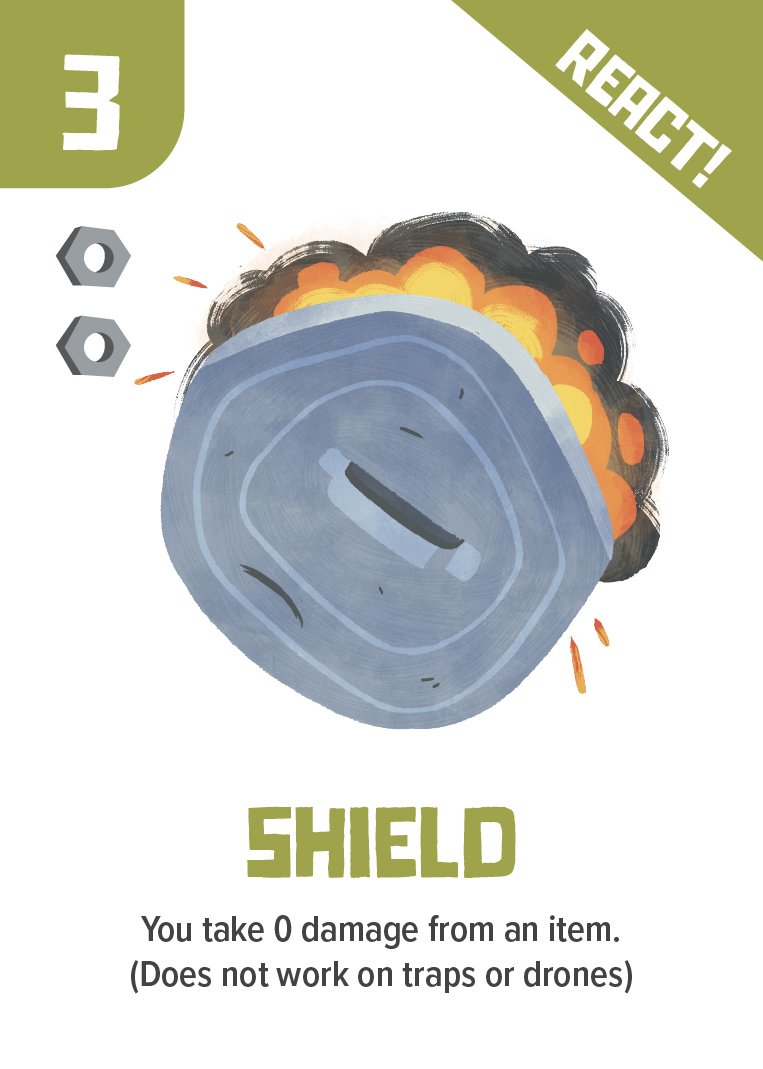


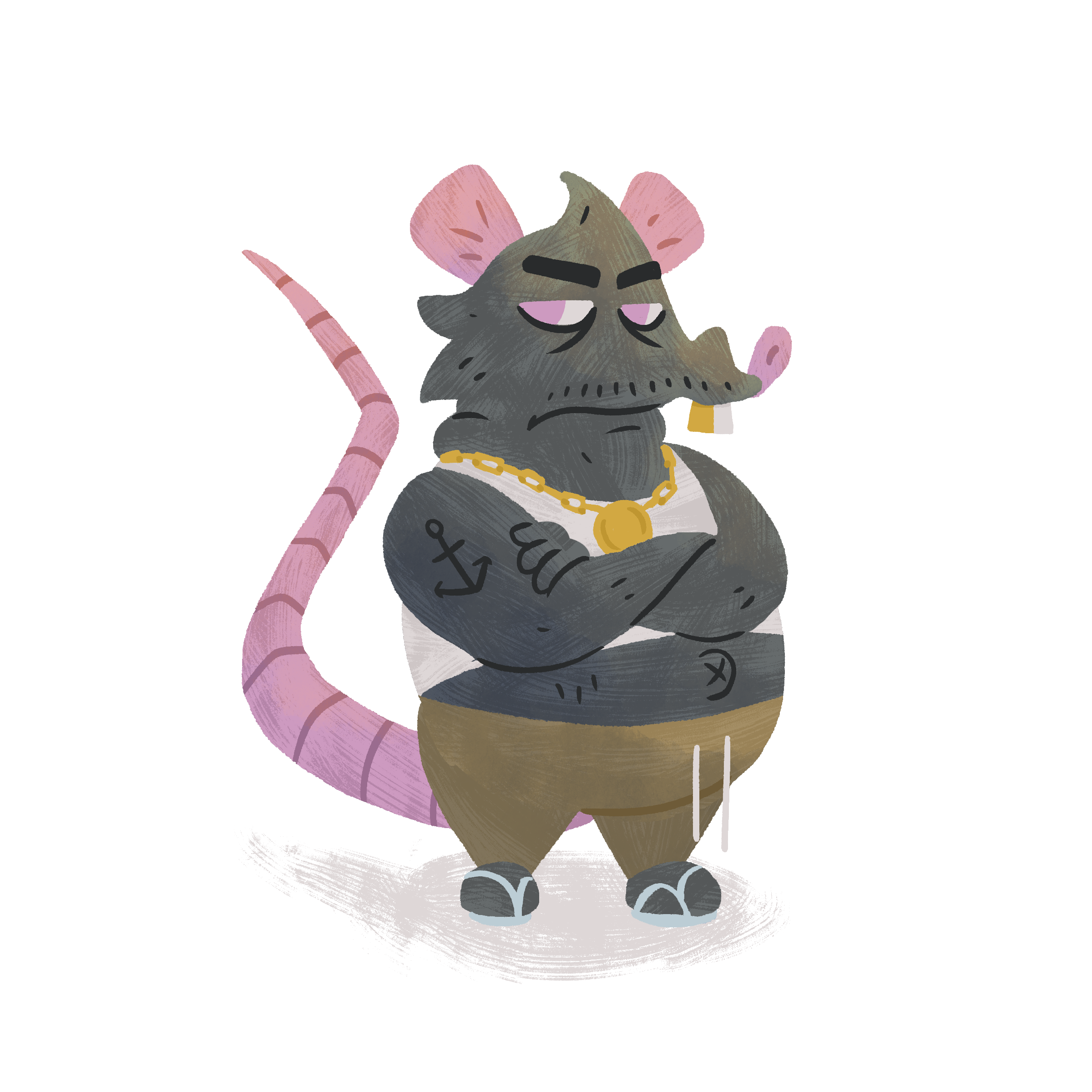
board and cards
I designed Press House’s wordmark to feel sophisticated, with a playful ‘E’ that resembles a French press. The rigidness of the wordmark is offset by a colorful background, adding a friendly aspect to the brand.


GAME BOARD